The good marketers would know that Call-To-Actions (CTAs) should come in the form of buttons. But the even better marketers know that simple buttons just don’t cut it in some use cases. Here are some of the different formats CTAs and their accompanying copy come in, and the software you can use to create them.
The Basic CTA
Sometimes when it ain’t broke, don’t fix it. The basic CTA comes in the form of a simple button. This can be as part of the copy on a website, at the bottom of a form, or as part of an illustrative image. With the help of some tools, you can even make the wording of the CTA dynamically change to align to the customer’s direct interest.
The Basic CTA: When should you use it?
When you just need a simple button in your copy to drive conversion. Or perhaps a button to encourage social sharing.
The Persistent Header CTA
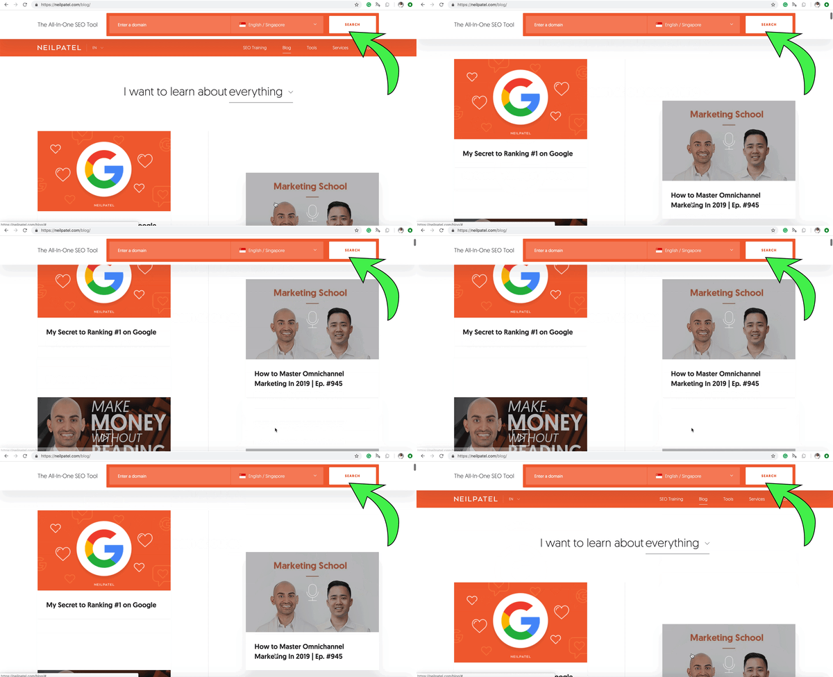
 Screen Capture of Neil Patel's Blog and his use of the Persistent Header CTA
Today’s marketing landscape requires marketers to prioritise customer experience to retain customers’ attention. The old days of pop-up CTAs are over.
Having the CTA above the fold – the visible portion of the website without scrolling – is a way to improve the visibility of your CTA. Having it at the end of the content helps reinforce the CTA. But you know what’s even better? Persistent header/footer CTAs.
The Persistent Header CTA: What it does
The persistent header/footer CTA remains in view regardless of scrolling. It ensures the CTA is readily available for action once the customer is ready to take action, yet does not interfere with the actual content.
The Persistent Header CTA: When should you use it?
When your content is long and the customer has to read at least some of the content before they are ready to take action. Generic offers, like a newsletter update sign-up, are also prime candidates for such a CTA format.
The Exit Intent CTA
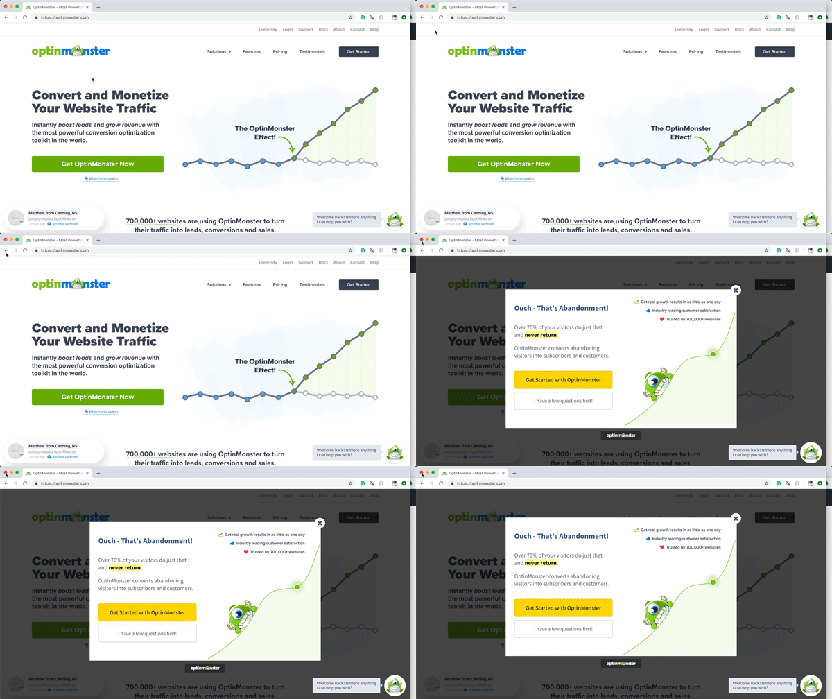
 Screen Capture of OptinMonster and their use of the Exit Intent CTA
Delivering value to the customer is crucial in today’s marketing. But it is difficult to maintain a balance between delivering value and driving conversions.
How do you deliver value to a customer who’s only on your website for information, and drive conversions by asking your customer to actively undertake a desired action at the same time?
What’s to stop the customer from leaving your website after obtaining the information they seek, without ever getting to your CTA? What’s to stop them from slipping through the cracks?
The exit intent CTA is the answer.
The Exit Intent CTA: What it does
The exit intent CTA is triggered every time the customer has the intention to leave the site. Usually this is triggered by the mouse moving towards the X button of the browser, or when the customer navigates away from the tab. It can take the appearance of a pop-up or an overlay to capture the attention of the customer right before the exit.
The Exit Intent CTA: When should you use it?
When the bounce rate of a page is high, this can be a complementary solution, although it is still important to optimise and improve the page content. It can also be used to drive conversions for users are likely to value your content after spending a substantial amount of time on the website, but have yet to take your desired action.
The ‘Web-to-Call’ CTA
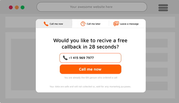
 Example of a web-to-call widget that pops up after clicking the CTA, image taken from CallPage
Mobile internet traffic has been increasing over the past few years, and take up nearly half of the total global internet traffic today. Consumers now demand instant gratification, and the mobile behaviour only further encourages that.
The ‘Web-to-Call’ CTA: What it does
Increasingly, businesses are placing call buttons on their websites and anywhere consumers may be exposed to them online. These CTA buttons allow consumers on mobile to transition from the web browser or app to the call function seamlessly, and connect to a representative of the business directly.
The ’Web-to-Call’ CTA: When should you use it?
If your business has a physical location, or if individual servicing is a crucial part of your leads nurturing process. In most cases, the ‘Web-to-Call’ CTA increases conversions – as long as you have the manpower to man the line.
Tools for the job
There are many tools out there that can help you create beautiful enticing CTA buttons. Here’s just a small selection of our favourite tools.
Tools for beautiful button designs in your call-to-action (CTA)

Canva (https://www.canva.com/)
While most content management systems (CMS) would generally have their own tools for creating CTA buttons, Canva is a great graphic design tool for laypeople. Just use its simple drag and drop tools to create your desired button design, save it as an image and you can place it wherever you want on your website. Best of all, it’s for free!
Tools for persistent headers / footers & exit intent CTAs

HelloBar (https://www.hellobar.com/)
HelloBar allows you to create persistent headers or footers CTA, as well as exit intent pop-up CTAs. It also allows you to A/B test your CTAs. They have a free plan for users with less than 5000 views per month, that allows the user to create up to 10 pop-ups. Upgrading to paid plans gives you advanced capabilities and greater limits.

OptinMonster (https://optinmonster.com/)
OptinMonster is another popular service that allows you to create persistent headers, footers and exit intent pop-up CTAs. It offers all the features of HelloBar, and also allows you to create lead capture forms on their platform, integrating your forms with your CTAs perfectly. However, it does not have a free plan, with its most basic plan starting at 9 USD per month.
Tools for ‘Web-to-Call’ CTAs

NovoCall (https://www.novocall.co/)
The internet, being a timeless platform where consumers may reach out to you at all times of the day, NovoCall helps you capture the leads that may slip through the cracks should they call you out of business hours. Novocall is a tool that helps you manage your “Web-to-Call” inbounds, by scheduling call-backs, and distributing the call-back workload among the team. It even helps to automate personalised SMS follow-ups after each call.
The basic plan starts at 39 USD per month, for 40 successful calls.

CallPage (https://www.callpage.io)
CallPage offers a similar service to NovoCall, but with some additional features. You are able to add custom fields to your CallPage widget to collect additional information when a customer clicks-through your ‘Web-to-Call’ CTA. You are also able to connect to Google Analytics directly to gain further insights, such as the call history and performance by advertising channels and traffic source.
The basic plan starts at 59 USD per month, for 40 successful calls.
Tools for dynamic CTAs

Hubspot (https://www.hubspot.com/)
To change CTAs dynamically for alignment to your customers’ direct interest, you need a platform that first knows your customer. HubSpot is one of the many Customer Relationship Management (CRM) platforms that keeps track of your website visitors, leads and customers. HubSpot allows you to create smart CTAs that change dynamically according to the visitors’ country, device type, referral source, preferred language, membership to your own segmentation lists, or the customer journey stage that they are in.
- - -
To learn all about crafting CTAs that convert, check out our free resource: 'ABCTA: The Ultimate Handbook to Call-To-Actions (CTAs)'. Learn the fundamental principles of CTAs, and understand how to deploy them effectively for your business today.

Click the banner above to download our CTA handbook today!