

What to Consider Before You Develop an Ecommerce Website in Singapore: Part 1


Is the traditional brick-and-mortar store dying?
Perhaps not, but it certainly does face fierce and unrelenting competition from the online marketplace. It’s estimated that global ecommerce sales will reach over $1.9 trillion through 2016, representing 8.7% of global retail sales, and that number and percentage are expected to grow even further over the next four years. A report from Google and Temasek Holdings has indicated that Singapore, in particular, has experienced a meteoric rise, with our 2015 ecommerce market valued at US$1 billion.
Virtually anyone can set up an online storefront these days. In the past few years, we’ve seen the rise of digital stores, from indie craft and clothing shops to giants like Lazada and Zalora. Capitalising on this growing market and setting up an ecommerce website in Singapore seem like a no-brainer, but where does one even begin in such a competitive space?
Today, the barrier to entry is lower than ever, with a wide variety of options that will let you develop your own ecommerce website, whether you want a hosted solution with quick setup and configuration, or a custom online ecommerce platform that will allow you to fully customise your online store.
There are a lot of choices out there, and whatever you pick will depend on your needs, technical skills, and target market. Whatever the platform you choose, though, there’s no denying the ecommerce website development benefits you’ll reap.
This article is an ecommerce website development guide that aims to walk you through the process of building an ecommerce website in Singapore, with careful guidance through every consideration that you must make each step of the way.
1. Choose a Domain and Hosting Provider

Domain registration
Before you start the process of ecommerce website development, you have to register a domain name for your future online store. A domain name acts as the address of your website, which allows it to be accessed on the Internet. Some common examples of domain names that you likely have encountered include Facebook.com, YouTube.com, and Google.com.
Not all domain names end in “.com”, or what is known as the “top-level domain”. There are other top-level domains like .edu, used most often by universities, .gov, held by the official websites of government agencies, and a variety of country-code top-level domains like .us and .uk. Some international websites have localised domain names—examples in Singapore include Lazada.sg and TheBodyShop.sg.
Selecting a domain name begins with the name you want for your company. Just like any business name, there are certain considerations you should have for your domain name. It should be:
-
A brand
-
Short and memorable
-
Creative and linked to your business
-
Intuitive and easy to pronounce
-
Free from copyright infringement
Your domain name is likely to stick for a long time, so think long and hard before committing to one.
After you choose your domain, as an online store you can choose among the top-level domains .sg, .com, and .com.sg, though the former two are generally much easier to work with. Remember, picking the right one can have an impact on the web traffic you get from Google.
Read: Should You Use .com or .sg for Your Singapore Business?
Domain Registrars
After you’ve decided on your domain, it’s time to select a domain registrar. There’s a whole host of domain registrars that cater to local and international needs, including GoDaddy Singapore, HostPapa, and SingHost.
Each host will offer you registration packages that vary in price depending on your desired top-level domain: .sg usually costs up to $80 per year to register, for example, while .com names can go much lower at around $10 per year. You can have a look at a list of all registrars accredited by the Singapore Network Information Centre here, or you can try other international registrars such as NameCheap and Dreamhost.
Read: Complete Guide to Registering a Domain in Singapore.
2. Choose the best platform for your e-Commerce store
eCommerce Website Platform
Now that you’ve got yourself a domain name, you need to choose a platform on which to build and host your ecommerce website. Each of the most popular platform options has something to offer, whether it’s ease of use, cost, customisability, or feature set. Let’s take a look at the most popular options and how they’re set up.
WordPress
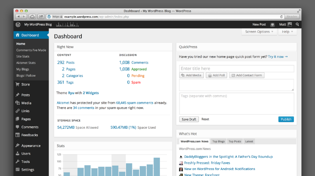
WordPress is well-known as a blogging platform, but it’s actually far more than that, acting as the backend of more than a quarter of the world’s top 10 million websites. Its ease of use, flexibility, and modular, plugin-based architecture allow it to be used effectively for ecommerce website development.
If you pick WordPress, you have two options for setting up your online store on this platform. The first is the one-click install method, in which you select a service that combines domain name registration and WordPress site hosting. Choosing a host that works with WordPress is subject to particular requirements: it must support PHP 7, MySQL v5.6+ or MariaDB v10.0+, and support for HTTPS.
Some hosting providers have partnered up with WordPress to make installation easier, with compatibility guaranteed. Selecting one of these providers will make your WordPress setup easy and affordable. WordPress itself recommends BlueHost, Dreamhost, Flywheel, and SiteGround.
Another option is for you to download and install the WordPress platform on your server, and configure it manually. This option is recommended only for advanced users, as it requires you to make use of an FTP client, set up a database, manage a server, and more. WordPress has an extensive documentation that can walk you through the process. You can also check out some of the many video tutorials on YouTube that will help you every step of the way:
Whatever method you choose to setup WordPress, you’ll have a fully functional, albeit barebones, website at the end of the process. It won’t look like much right off the bat, but the beauty of WordPress is its plugin-based design—you’ll be able to transform your site into an ecommerce website just by installing an appropriate plugin.
The most popular WordPress plugin for building an ecommerce website is WooCommerce, a highly customisable platform that gives you complete control over your storefront. WooCommerce is behind some 30% of all online retailers; some local stores that use it include Coast Cycles and U-Win.
Building ecommerce website with WordPress may potentially require some effort and setup, but you’ll be rewarded with extensive and unparalleled control over your online store. But if all this seems too much for you, we can help with your e-commerce website setup.
Wix
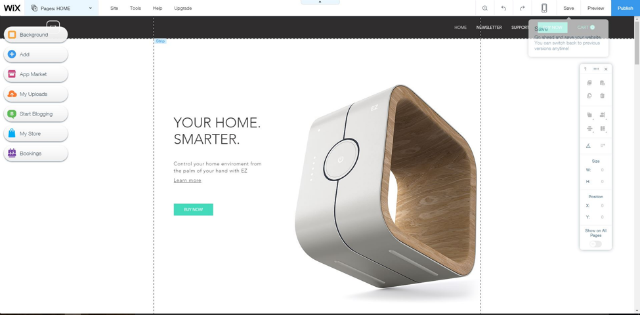
Wix is an easy-to-use platform that anyone can use to get a website up and running in 10 minutes, even without coding skills, thanks to its “WYSIWIG” or “What You See Is What You Get” editing interface. Wix provides intuitive drag-and-drop tools, a variety of templates, and a wide array of Apps that can extend the functionality of any website, making it incredibly easy to start.
All you have to do to get started with Wix is to sign up for an account at Wix.com, after which you’ll be able to set up your website with any templates you desire, and then go on to edit it to your heart’s content. Wix’s ecommerce templates are worthy of mention, as they automatically provide mobile optimisation, complete store management with order tracking, shipping, and elegant design layouts.
Wix.com already includes hosting and domain registration, making it an all-in-one package that will let you get your ecommerce site up and running with just one provider.
Squarespace

As a website builder, Squarespace excels in exceptionally beautiful design templates, as well as a highly design-oriented interface. The intuitive drag-and-drop interface makes use of Blocks to add content components to a website, whether it be video, audio, text or anything you’d like to add. Its extensive style editor features plenty of flexibility, with easy editing of image opacity, fonts, colors, block dimensions, and more.
Couple those with responsive web design, and just about anything made with Squarespace will look great. Image-centric storefronts, minimalistic designs, and modern, “expensive-looking” ecommerce sites all can be easily constructed in Squarespace.
Squarespace is easy to get into. The website provides plenty of tutorials, in both article and video form, to help you get started. You’ll be introduced to the basics of design, setting up an ecommerce site, connecting a domain, and more. Squarespace also offers domain registration to go with its hosting package, so you can get everything you need just from one site.
Shopify
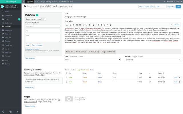
While other platforms are general-purpose and allow for the creation of a variety of website types, Shopify explicitly focuses on ecommerce website development. Setting up Shopify is simple: create an account, pick from over a hundred themes to apply to your shop, select a monthly plan according to your needs, and add your products. From there, your store is already up and running.
Shopify also allows you to add Apps, or tools that can add functionality to your ecommerce website. Apps can provide you with features like customer care handling, management of inventory, shipping and tracking, expense reports, and more—over 1,500 Apps populate the Shopify App Store, fulfilling just about any need you might have. Check out our Shopify case study to see how you can get a custom website built to your needs on Shopify.
Read: B2C eCommerce: Know Your Customers, Including Those Whom You'll Never Meet
3. e-Commerce Functionality and Usability
Every ecommerce platform is structured around basic features that any storefront is expected to have. Whether you’re using WooCommerce on a WordPress site, a Wix.com shop, a Squarespace site, or a Shopify storefront, they will all offer the same functionality that will allow shoppers to view and purchase products, track their orders, pay online, and other tasks essential to the shopping experience. Let’s have a look at each of these basic features, and how they are handled by different platforms.
Product presentation
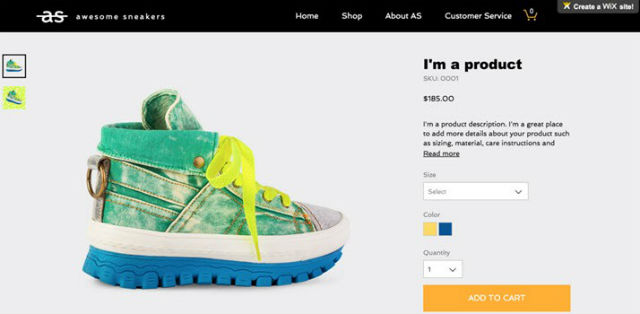
Any shopper visiting an online storefront will be looking primarily at product pages and galleries, so proper product presentation functionality is key. With Wix, you get plenty of options over individual product pages that will allow you to present them to shoppers with all the information they need. Shoppers looking at a product on a Wix page will see product photos, with a zoom function for closer inspection. Also available are overviews, detailed descriptions, and embedded hyperlinks.
Wix also lets you add SKUs for variations on a product, which include different sizes and colors of the same item.
Checkout, payment, shipping
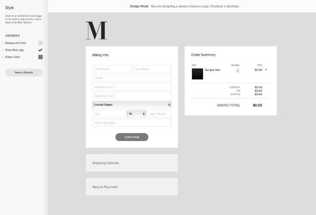
You can’t have an online store if your shoppers can’t pay you for things they want to buy. Modern online ecommerce platforms integrate virtual shopping carts, payment processors, and shipment tracking into every store.
Squarespace makes it easy for shoppers to select items for purchase, checkout, enter shipping details, and pay with their payment option of choice. All of this is done through secure, SSL-encrypted checkout and payment pages that ensure all transactions are safe from malicious interception.
Squarespace also provides options for shipping rates, including flat rate or weight-based, as well as VAT/GST rates for countries around the world. You can even choose which countries you’re willing to ship to.
Read: Guide to Ecommerce Payment Gateways in Singapore
Order management

Even a mildly popular ecommerce website will quickly rack up a huge list of orders that is too difficult to manage without some kind of automated solution. Shopify provides a wide array of features that help with this, such as full inventory tracking of all products, order notifications via email, SMS, and RSS, payment and shipping status tracking with detailed reports, and customisable views of all active orders with selectable filters.
Additional features
While we’ve covered the most basic features that should be present in any ecommerce platform, there are also features that don’t come by default. These can be additional plugins or Apps that could have certain ecommerce website development benefits.
For example, WooCommerce features a plugin called Recommendation Engine, which provides AI-driven product recommendations to shoppers based on their purchase history, product view history, and products that are often purchased together.
There’s also a variety of email marketing plugins for WordPress that allow ecommerce site owners to engage more effectively with their customers. One of the best known is MailChimp for WordPress, a plugin by MailChimp, one of the most widely-used email marketing platforms around. This plugin integrates with WooCommerce and offers sign-up forms, automatic campaign generation, email tracking, and more.
Even group buying is covered by plugins. WooCommerce Group & Daily Deals allows you to host promotions to offer products and services at a discount as long as a certain number of people purchase them. This plugin lets you set maximum and minimum quantities for the deal to activate, set different kinds of deals and offer to specific categories of customer, automatically schedule deals, and create reports for each group deal that is generated.
4. Mobile and Responsive Design

Today, Singapore has the highest smartphone adoption rate in the world, with 85 percent of Singaporeans owning a smartphone in 2014. As a result, it’s important for any Singaporean ecommerce site to have a mobile experience that’s just as good as its desktop browsing experience.
Mobile-friendly designs
Responsive web design is an approach that tackles the design problem of varying screen sizes, dimensions, pixel densities, and other display characteristics that change between mobile and desktop. So important is the need for websites to look great on mobile and desktop alike, that in 2015, Google’s search algorithm began prioritising mobile-friendly websites in its search rankings for searches made from mobile devices.
Having an ecommerce website that conforms to responsive design is key to improving your user experience and search ranking. Thankfully, most major ecommerce platforms already have support for responsive design, and integrate preview tools into their style editors to ensure that you have control over your site’s appearance on any device.
Responsive design
Responsive design serves users the same HTML content from the same URL, no matter what browser they use. Website elements are scaled and moved around automatically to fit the aspect ratio and screen size of the device being used.
Design Museum Shop is a local online store that makes use of the Shopify platform. Below you can see the site as it appears to any user viewing it on a desktop browser.
.png?width=695&name=Design%20Musuem%20(web).png)
Here is the exact same site, but viewed on a mobile phone. The URL has not been changed, and the same website is being served, except adjusted for an optimised mobile viewing experience.
.png?width=695&name=Design%20Musuem%20(mobile).png)
Responsive design-based webpages have the drawback of loading just as slowly on mobile as they do on desktop, even if some interface elements are not visible. This is because the exact same webpage content is being given to a mobile phone as with a desktop browser.
Adaptive design
In contrast to responsive design, adaptive design serves users different HTML content depending on the device they’re using, but from the same URL. Adaptive design requires that separate layouts be made for every possible device screen size. When a device requests the webpage from the site, it also sends its user-agent string, which declares what kind of device it is. The site will in turn determine what HTML page will be served to the device.
Adaptive design usually means that three versions of every site exist: smartphone version, a tablet version, and a desktop version. Sites that use adaptive design load faster on mobile, because the mobile versions have omitted the resources that are not visible on mobile. There is also no layout processing required to adjust each element on the site to the screen size. However, adaptive design requires several versions of each site to exist, and every time the templates or content are updated, every version must be modified as well.
Separate or m(Dot) design
Before adaptive and responsive design became widespread, so-called m(Dot) design was the method of choice for websites to deal with mobile users. m(Dot) websites served different HTML content from mobile-specific URLs, usually prefixed with “m.” (hence the m(Dot) moniker).
Today, such separate design principles can still be found even in the biggest websites on the Internet. For example, the mobile eBay page is an m(Dot) page, loading a highly simplified and mobile-friendly layout compared to the desktop version.
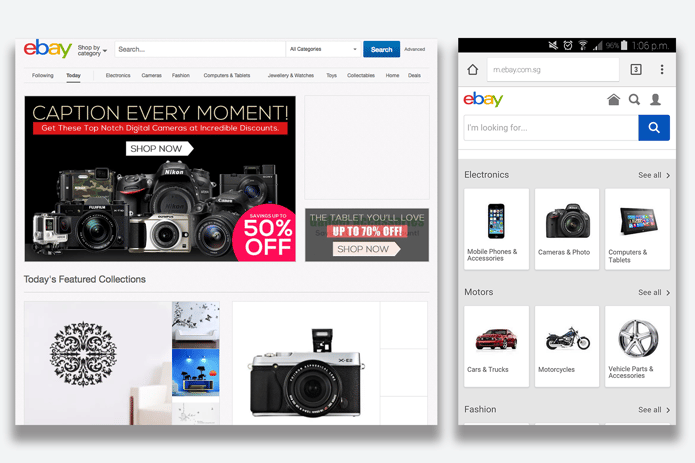
m.facebook.com is another site that uses m(Dot) principles. This mobile version of Facebook has a reduced feature set compared to the desktop site, and even compared to the mobile app, but it’s lightweight.
Finally, m(Dot) sites can also be used to provide entirely different functionality for a site depending on where it is accessed. For example, the desktop website of the Uber ridesharing service only allows users to review their trip history and create support tickets. However, m.uber.com allows users to actually make use of the service and call a vehicle to their location, as though they had installed the Uber app.
m(Dot) sites are somewhat inefficient for most modern uses. They require two entirely separate versions of a site to be maintained, m(Dot) links are not efficiently cross-shareable from mobile to desktop because of layout differences, and may increase loading times.
Responsive, adaptive, m(Dot)...what should you use?
Today most major sites use responsive design as their web design philosophy. Its adaptiveness and low maintenance requirements far outpace the minor drawback of slowdown. For most businesses and eCommerce websites, responsive design is the way to go.
Key ecommerce functionality
Given the great prevalence of mobile users, it’s imperative that they get the same basic functionality with their online shopping experience that desktop users do.
Product pages
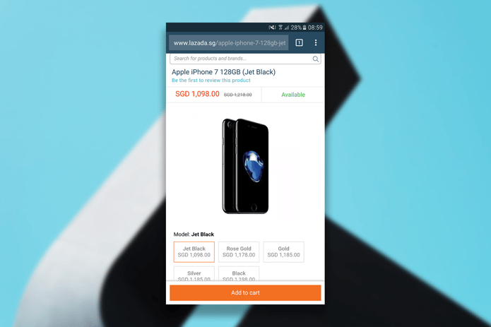
Mobile users should get always get a detailed and informative view of products on sale. Different SKUs for colours or configurations should be selectable, and additional information should be readily accessible.
The mobile page of Lazada, a prime ecommerce website in Singapore, is a great example of this, with the layout of information essentially the same, just arranged in a single-column fashion to accommodate mobile devices.
Checkout page

Mobile users should be able to manage their shopping carts, select payment options, input shipping addresses, and complete their orders, all from their devices without having to resort to any intermediary step involving a desktop browser.
The Zalora page does a good job of organising all the necessary information and options to this effect—notice how shipping cost, notifications for free shipping, item availability, changing sizes and quantities, and checkout are all included within a single view.
Shipment tracking
Users should be able to check the status of any orders and shipments that are currently pending, no matter the version of the site they’re using. Lazada has a great interface for this, with all pertinent information displayed, including the option to return one’s order.
![]()
This ecommerce website development guide has covered some of the most basic considerations so far. In part two of this article series, we’ll take a look at some of the more in-depth considerations that’ll help you take your ecommerce site to the next level.
Check out our Part 2 of What to Consider Before You Develop an Ecommerce Website in Singapore.
Looking for more eCommerce articles? Check out our comprehensive eCommerce resource page.
Image sources and credits:
Header image: Negative Space @ Pexels
Body images: EstudioWebDoce @ Pixabay; Clovis Cheminot @ Pixabay
Images of online shops courtesy of their respective websites
More insights