Content Outline
What to Consider Before You Develop an Ecommerce Website in Singapore: Part 2

In the first part of this article, we talked about some of the most important things you must know at the very beginning when setting up an eCommerce website in Singapore.
We walked you through choosing a domain name registrar, detailed the differences between major hosting providers, talked about the most important features that an eCommerce website should have, and explained the importance of mobile and responsive design in this day and age of widespread smartphone usage.
In this second part, we move deeper into the realm of eCommerce website development, as we look at some of the considerations you should be making for your backend, your site’s appearance, and the content you’ll be producing.
4. Attractive Colours, Layout, and Design

Like it or not, the appearance of your website will be a huge driving factor behind its success. Various studies have shown how big of an impact design can have: good design results in more trust for the credibility of different websites; a visually attractive website will have users stick around longer and thus more easily convert them into paying customers; and a good first impression means people will be happier with your website.
Such positive correlation of good design with the success of eCommerce websites has been suggested as early as 2009, back when online shopping was just on the rise.
Let’s take a look at some popular local eCommerce websites and see how their design philosophies compare and change based on the needs they serve.
Redmart
Online grocery shopping was one of the earliest innovations to come out of the eCommerce boom of the ‘90s, but it succumbed to the dotcom bubble burst that came at the turn of the century. Only in the past few years has it experienced a resurgence to the point of reaching widespread popularity.
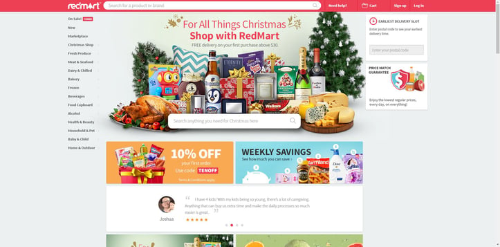
Redmart is one of the premier online grocers in Singapore, and its website shows how it has the grocery shopping experience down to a fine art.
Redmart's design
The main deals of the day are situated front and centre, while bestselling products are situated a short scroll down. Farther below are categories with bright, attractive, and representative photos, along with the number of products in each, instantly providing an idea of just how much choice is available to shoppers. 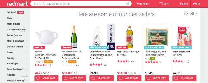
Meanwhile, categories are shown in plain view on the left side, and a search bar to view the entire database is right up top—both of these search features remain visible no matter how far you scroll down the page.
In addition, the price-match guarantee link on the right part of the page indicates how Redmart is dedicated to the grocery staple of having the lowest prices: clicking on that link immediately directs you to a page that explains what is eligible for a price matching claim, provides a link to submitting those claims, and indicates the terms and conditions.
Finally, the site’s predominantly red colour scheme appears to be inspired by the research stating that the colour red makes viewers hungry—an appropriate scheme for a site that allows you to have food delivered right to your doorstep.
Redmart’s mobile experience is relatively similar, with everything simply rearranged into “cards” organised vertically into sales and categories. However, the mobile site’s front page provides much less information, displaying limited individual deals and bestsellers.
Lazada
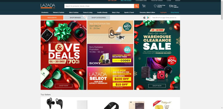
Lazada is the largest eCommerce site in Southeast Asia, and its extensive retail selection demands certain design philosophies that make it essential to be as easy as possible to find what you want.
Lazada's design
The first thing you see are the biggest deals arranged in cards and resized according to magnitude of savings. Scrolling down shows you the best deals in several categories. The search bar remains up top no matter where you go.
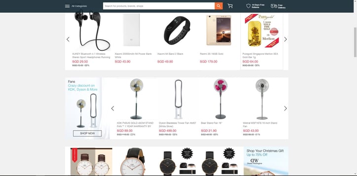
The main categories are briefly visible directly below the search bar, but disappear after you scroll a quarter way down or so. Clicking on a category shows an extensive list of subcategories and even further child categories. The sheer number of them can be overwhelming to explore, but given that Lazada deals in practically everything under the sun, there probably isn’t a much better way of doing things.
In a nice touch, typing a search in the search bar will not only provide suggestions, but also popular products that may be matches for what you’re looking for, along with their current list prices.
The Lazada mobile homepage is somewhat less interesting, with the card views of the top deals being reduced to a carousel that gives no indication as to the importance of each. Also, the entire page is eaten up by a rather redundant display of all the categories, when these could otherwise be called up with a touch of the menu button. 
Thankfully, the product views are just as detailed and easy to use on mobile as the desktop version.
HipVan
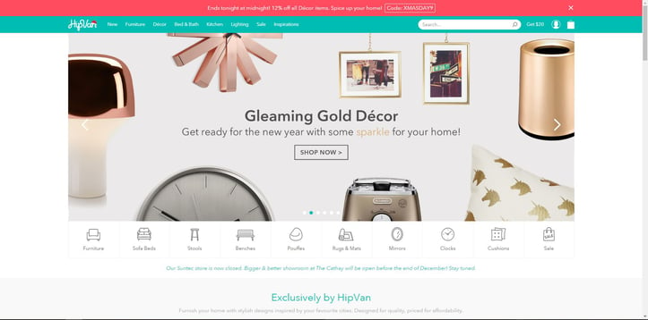
Where Redmart provides a huge selection of grocery categories and Lazada sells virtually anything else you can think of, HipVan takes a decidedly more focused approach and only acts as a seller for furniture and home accessories.
HipVan's design
Given how furniture is often in essence an aesthetic choice, the site makes the right move of sticking to a minimalistic design, with plenty of whitespace and basic design elements.
By placing the products themselves front and centre, the site’s design draws no attention away from them. At the top of the page, deals are displayed in a carousel, with furniture types displayed below. HipVan also provides options to search by a variety of collections, or by room.
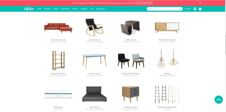
The site also provides editorial picks all the way to the bottom, as well as the usual indicators of free shipping, free returns, price protection, and a “70,000+ Happy Customers Recommend HipVan” sign. Helpfully, an instant “Return to top” button is displayed on the lower right.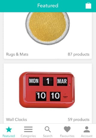
Unlike Redmart and Lazada, HipVan’s mobile site provides an identical experience to the desktop site—all interface elements, categories, deals, and others are present, rearranged for the vertical aspect ratio of a mobile screen.
Good eCommerce website design practices
When building an eCommerce website, you must be aware of good practices in designing your site layout. Our in-house designers have defined three helpful practices to ensure that your site is visually appealing.
a) Know the ins and outs of your online store.
Designing a good eCommerce website, due to its complexity, is defining the information architecture and content first. Without such planning, you might realise that there is missing information that’s required to be in the site.”
– Kendrick, Digital Designer, Construct Digital
It’s easy to get lost in the complications of the eCommerce website development process, given all the design elements, variables, marketing aspects and other things you need to consider.
eCommerce sites are first and foremost about providing information about products, and if you don’t have this in mind at all times, you may eventually end up overengineering your site to the point that the information you want to present may be muddled, overwhelmed by other elements of your site, or even omitted entirely because of oversight.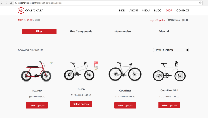
When Coast Cycles tasked us to create its online shop, we learned everything we could about their products to come up with a website that had a solid information architecture.
From the ground up, you want the focus of the site experience to be on product-related content. Design your site in such a way that there’s always room for many large and attractive images. Depending on the products you sell, you may also want to have a built-in zoom function for images so customers can get a closer look—this is most valuable if your site sells clothes or furniture.
You also want to have detailed information displays that cover every possible piece of product information conceivable—for example, an online clothing retailer should have size, colour, and washing information displays available. You should also have the shipping and return information easily seen upon viewing any product.
Part of the core shopping experience should also be displaying related products, and this part of your design can’t be an afterthought—it should be an essential part of the design process. Make space for a carousel of related products below any product page, and if you have individual tracking for the purchases of each customer, try to have a recommended products section on the front page or dashboard as well.
b) Make it hyper user-friendly.
Design is like cooking—a pretty dish doesn't mean it's delicious. A fancy website or mobile app doesn't mean it is a good one. A good website should give users the best shopping experience.”
– Rikky, UX/UI Designer, Construct Digital
We’ve already established that an attractive site contributes greatly to trust and conversion rates. However, this metric only applies if the experience of using the site is optimal as well. Ensure that no matter what your design philosophy is—minimalistic, complex, or popping with fireworks—a customer should always know what to do next.
For the designers, it can be difficult for them to gauge how elegant their approach is, given that they're so used to it. Get friends or family who are regular online shoppers and ask them to test a prototype of your site. If they can’t intuitively figure out how to use it based on their experience, then you need their feedback to get a redesign.
Also useful is feedback from people who do not shop online regularly. There will be some people who are new to online shopping, who will come across your site and not know intuitively how online shopping platforms work.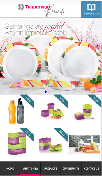
Clean, user-friendly, and intuitive—the mobile app we created for Tupperware provides a better digital experience to its 100,000 users!
c) Adopt a mobile-first mindset.
In my opinion, we should be taking a mobile-first approach. There is a higher percentage of users using mobile phones to browse the Internet now more than ever.” – Cherrie, Senior Digital Designer, Construct Digital
As we covered in the previous part of this article, mobile browsing now represents a major part of Internet use, and having responsive design and key eCommerce functionality are essential to the success of your site.
Try to preserve as much functionality as possible from desktop versions of your site in the mobile version. Indeed, if possible, design the mobile site first, and scale it up accordingly to a desktop site. HipVan’s site is a great model as the mobile experience is identical to the desktop one.
One thing to note is that the ecommerce platforms we previously mentioned have responsive design built into the core of the user experience, in effect perfectly preserving functionality and design across mobile and desktop. While this is convenient, it may not work perfectly especially if you designed the desktop version first, with complex designs.
Either start with the mobile interface first and foremost, or run many tests on the mobile version of your desktop design to ensure that no interface elements or product information are omitted, blocked, or otherwise rendered unavailable.
5. Security and Backup

As an eCommerce site, you will be dealing with your customers’ payment information. Such information is highly attractive to malicious hackers, who could use a variety of attack vectors that can intercept secure data in transit and steal users’ credit card numbers, PayPal account details, and even their identities.
To prevent this from happening, certain web security protocols exist that should be in your eCommerce site to ensure the safety of your customers’ data.
Secure Sockets Layer (SSL)
Secure Sockets Layer (SSL), now also known as Transport Layer Security (TLS), is a protocol that ensures the security of information transmitted over the Internet through the use of cryptographic techniques. Information transmitted over SSL is encrypted before transmission, then decrypted at its destination. SSL-secured information cannot be read by third parties if intercepted before it reaches its target.
Getting SSL
You can make use of SSL by purchasing an SSL certificate for your domain name. Having an SSL certificate assigned to your domain name displays a special icon in a user’s browser address bar that indicates that all information passing through your domain is secured.
In the web browser screenshot below, we see that the website being visited is secured over SSL, indicated with a green lock icon to the left of the URL.

Acquiring an SSL certificate can be done right through your domain name registrar or hosting provider. This is usually an option that can be availed of through the registration process, but it can also be purchased after the fact. You also have the option of purchasing an SSL certificate from a dedicated SSL provider such as RapidSSL.
Having this certificate not only prevents data theft, but also gives your customers a sense of security and trust.
Server configuration
If you’re running your own web server, or using a hosted server with plenty of manual setup and maintenance, it’s essential to have a secure configuration and at the very least a firewall to prevent attacks on your system.
A firewall is a service that controls access between a trusted network and an untrusted network. Firewalls will not allow data packets or traffic to pass into the trusted network if it is not whitelisted in the firewall’s security policy.
Modern firewalls can detect and defend against packets from known malicious websites, as well as malformed traffic that could indicate the misuse of information transfer protocols.
Self-hosted vs. managed hosted solutions
The nature of security configuration and maintenance differs greatly depending on whether your eCommerce site uses a hosting provider or is a self-hosted solution.
In the case of a hosted solution, security maintenance, SSL certificate updates and renewal, configuration, and platform updates in general are taken care of by the provider. Backups of data will also be done on a regular basis, which you can retrieve at will, and downtime will be responded to accordingly by the provider. You won’t have to worry much about this, though you will understandably pay upfront for this convenience and peace of mind.
For self-hosted solutions, you may have to stay on top of software updates, patches, your SSL certificates, and take care of any server downtime you experience. Not all hosting solutions require this level of micromanagement—if you use Amazon Web Services for example, you will have plenty of control over your platform, while if you pick Heroku you’ll have a lot less to think about as the provider will manage your needs.
Did you know that Construct Digital can also host your ecommerce website? We provide managed hosted solutions that come with full backup, regular plugins update, and security patches on your ecommerce platform—all for a reasonable rate of S$1200 per year. Click here to ask us about it!
Updated plugins
Any plugins and software you use with your eCommerce site must always be kept up-to-date, whether this is done manually or through explicit permission to self-update. Updates to your plugins not only fix bugs or add new features, but often also fix security holes and exploits that can be used to compromise your platform.
Security plugins
Some plugins run the whole gamut of security requirements, and can be applied to your website. Sucuri Scanner, for example, can monitor all security events in your WordPress-based site, scan for malware remotely, detect and prevent intrusion, and much more. Used in conjunction with other Sucuri products, it can be a one-stop security solution for your website.
6. Third-party Integrations (CMS, CRM, Analytics, Payments)
The most popular eCommerce hosting providers on the market can extend their basic functionality through the use of plugins or apps. We briefly covered some of these in the last article, so let’s have a slightly more in-depth look at them.
WordPress Plugins
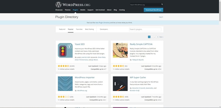
WordPress features over 50,000 plugins to choose from, both free and premium paid. Plugins can do anything, from adding a forum to your WordPress site to tracking site statistics. Even WooCommerce, the eCommerce platform that we recommend for WordPress, is a highly complex and extensible plugin.
Squarespace
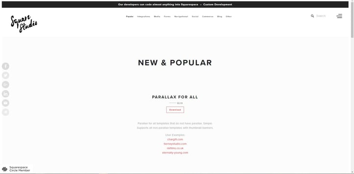
The SquareStudio Plugins marketplace gives you hundreds of plugins that you can install to provide your Squarespace site with more functionality. The plugin store organises everything into categories, helping you look for the ones you need. Square Plugins generally cost money to implement on your site, though there is a Freebies section that you can check out.
Shopify
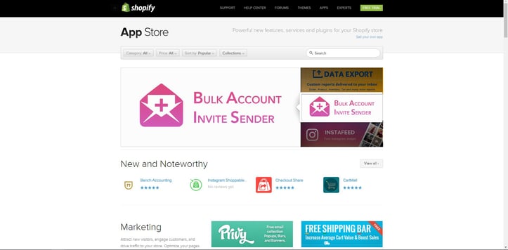
As Shopify is centered on eCommerce, Shopify App Store is populated with over 1,500 apps that all work to enhance your eCommerce functionality. Apps can help you manage your store inventory, track shipments, setup subscriptions, and much more.
Wix
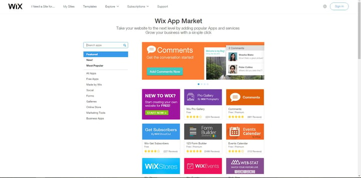
The Wix App Market has a whole host of Apps, both paid and free, that can give your Wix site just about anything you need for it. Apps can provide comments sections, calendars, instant forms, and even Wix Stores, a quick-and-easy way of creating an eCommerce site through Wix.
Top plugins
The most important and widely-used plugins can be extremely useful to your eCommerce site. Let’s have a quick run-through of some of them.
a) Google Analytics
Google Analytics allows you to track visitors to your store, and can generate reports that will help you with your marketing. This plugin or direct integration with Google Analytics are available in various forms for the majority of eCommerce platforms, including all listed here.
b) Akismet
Akismet aggregates data from various communities and blogging platforms to defeat spam comments on blogs. It’s available for Shopify and WordPress.
c) MailChimp
MailChimp is an email marketing provider that can put your customers and subscribers on custom mailing lists, allowing you to market to them directly. It’s available for the four platforms listed here.
d) Yoast SEO
A WordPress-specific plugin, Yoast can help improve your SEO, and get your site to the top of search engine results.
7. Search Engine Optimisation

SEO is essential to modern website development. It’s a long and complex topic that requires its own article to even scratch the surface. In this article, we briefly go over the most important elements of SEO that can be used to optimise your eCommerce website.
Mark-up tags
Mark-up tags allow search engines to display useful information about products from eCommerce websites. When products on eCommerce sites have the appropriate mark-up tags, if they appear as search results on search engines, they’ll have additional, relevant information displayed in an easy-to-read fashion. For example, in this Google search for a Samsung Galaxy S7, a result from the Lazada website appears, which include rich snippets such as price and rating.

Mark-up tags for a product do not directly affect search engine rankings, but they may improve the number of clicks on the product, which naturally leads to improved rankings.
The current mark-up vocabulary standard is Schema.org, which both Google and Bing can understand and implement.
Mark-up tag types may include:
- Microdata vocabulary, which includes inline tags directly in the HTML of the product information to denote rich information.
- JSON-LD, or JSON for Linking Data, which Google currently prefers over microdata, though Bing does not support it at this time.
Category pages
Having category pages not only makes it easier for shoppers to find what they need, but are also vital to SEO.
A category page with relevant content will outrank a category page without it. This works hand in hand with how Google matches keyword variations in searches.
Having unique copy specifically for category pages will also help rankings as it will help shoppers decide what to purchase. Five hundred to 1000 words is sufficient for this, and it should be primarily focused on quality writing rather than SEO keyword stuffing.
Customer reviews
Customer reviews and ratings of products aren’t just for your benefit, but can also greatly influence the shopping habits of customers who view them. Research has shown that most customers:
- Check customer reviews as part of their decision-making process.
- Trust customer reviews in general.
- Will change their mind about a product if it features negative product reviews.
In addition, shoppers are more likely to purchase from an eCommerce site that features customer reviews, so this will definitely influence your rankings.
Product description
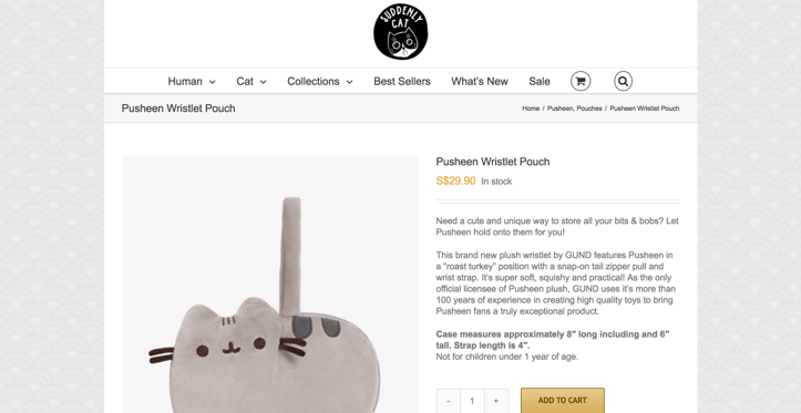
Every product should have descriptions for the benefit of shoppers. The above image features a sample product description from local cat-themed retailer SuddenlyCat, which showcases a cute, unique description that covers all of the keywords related to the item it’s selling, while remaining short, to-the-point, and natural-looking.
Here are some of the most optimal practices for writing descriptions:
- Don’t just copy-paste descriptions from the product’s original manufacturer, but create unique sales copy that will inspire sales.
- Use long tail keywords or keywords that consist of multiple words which are highly specific to your product, as these will ensure that search engine results go back to your product.
- Stick to a length of 150-250 words, and use bullet points when you can.
Alt-text on product images
Alt-text describes the content of your images, which allows visually impaired users with screen readers to still know what’s in the image. Alt-text is also useful for search engines, because they do not process images.
Here are some good alt-text practices:
- Be short but descriptive. A picture of a cat playing in a bathtub should have an alt text of “cat playing in a bathtub,” not just “cat.”
- Don’t keyword-stuff, for example “cat calico tabby feline cat bath playing,” as this will negatively impact your ranking.
- Filenames are important, so try “cat-playing-bathtub.jpg” for the above example.
Conclusion
Throughout this article, you’ve learned the rudiments of developing an eCommerce website in Singapore, starting right at the beginning with choosing your platform and knowing what basic features an eCommerce site must have.
You’ll also have learned about mobile and responsive design, and seen local examples of eCommerce site design and layout, as well as what works about them.
Finally, we’ve covered the importance of security and SEO, and the importance of plugins to eCommerce platforms.
Armed with this information, you’re now definitely ready to venture into the world of eCommerce and start your own online shopping site with ease. Keep in mind that we’ve only covered the most basic principles and considerations; the process of innovating, adapting, and enhancing your eCommerce site will fall to you and your future experience and research.
If you have further questions about building your eCommerce site and want to go beyond the fundamentals, Construct Digital has you covered with a wide array of services and consultation offers. 
Looking for more eCommerce articles?
Image sources and credits:
Body images: picjumbo @ Pexels; Pixabay; StockSnap @ Pixabay
Images of online shops courtesy of their respective websites
About the Author


Guide
Assess Your IMPACT
Try our IMPACT scorecard to discover how your marketing stacks up across our six-pillar framework. Get a data-driven scorecard that identifies gaps and opportunities for measurable growth.

